a little coversation between Jeff Schlanger and Mark Weber:
Sure, Mark,
you, your poetry and the lands through which you move did it.–JEff
JEff,
I LIKE IT ! Can we send it to Klaus @ Metropolis website, maybe he’ll mount it.–mark
Mark,
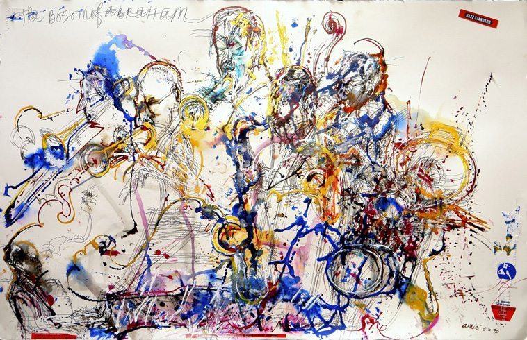
I’ve been enjoying your mellow baritone introduce a beautiful mix of music and remembering it delivering some poems live downtown. Yesterday musicWitness did some marker work on the cover of my inscribed copy of Long Division to better reflect the headlights coming at you during long night drives across the American West.
Even though this may not be what you were expecting from Santa, Happy Holidays and a healthy and creative New Year !–Jeff
I have a huge regard for Jeff Schlanger’s graphic art, and his jazz art, easily one of the main cats , up there with David Stone Martin and Leo Meiersdorff, so if he wants to scribble on the cover of one of my books then I think it’s worth looking at. Picasso used to do things like that.–Mark
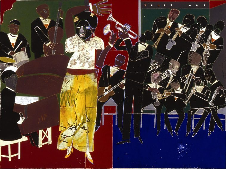
Yes, Mark & Klaus, this is becoming a most appropriate notice of the ongoing resonance of Romare Bearden’s uniquely musical art in 2010. The 3 Bearden pictures forwarded were intended to illustrate our conversation which had begun with Mark’s poems and has come now, with Hal McKusick’s help, to encourage a further look into art & jazz.
Romare Bearden’s art sings eloquently for itself, no need for verbal comment from this musicWitness®, who is looking to speak through pictures made during live performance. —Jeff Schlanger
Joe Henderson-Black Is The Color | Label: Milestone Records | Catalog#: MSP 9040 | Format: Vinyl, LP | Released: 1972
. . . just where can a person find Vinny Golia’s graphic works? We know from his biography that he spent his years in New York City, before moving to California (via Zuni, New Mexico) that he was an artist. The only examples I’ve ever seen are on album covers and they bear further investigation. There is Joe Henderson’s BLACK IS THE COLOR which is a fast line drawing, as is the cover to Dave Holland & Barre Phillips’ MUSIC FROM TWO BASSES. His (uncredited) work with airbrush can be found on the Chick Corea Lp THE SONG OF SINGING. Just those 3 and they date from the early 70s. Then, when he started Nine Winds Records he put some of his art on the covers of the early issues — most notably the airbrush art on NW # 3, the double-Lp IN THE RIGHT ORDER by Vinny Golia Trio. Others on Nine Winds would be # 9 Lp THE GIFT OF FURY and # 27 Lp OUT FOR BLOOD which remind somewhat of Philip Guston’s works on paper, pencil and ink. Glutinous amorphous shapes tumbling together in two dimensions. —Mark Weber
Leo Meiersdorff: 1934 – 1994
Leo Meiersdorff was born on December 14th, 1934, in Berlin-Charlottenburg, Germany. Meiersdorff grew up at the obscure family estate in East Prussia, where he discovered his love for music at a very early age. He practiced Beethoven and Mozart on the old family piano with so much passion and enthusiasm that everybody foresaw his future as a concert pianist.
All that changed however, when after the war he was sent to Berlin to study art and classical music at the academy – and for the first time he heard on the armed forces network radio the music of the Americans: JAZZ. He became fascinated with its sound and rhythm; Ludwig and Amadeus went out of the window as Leo switched to jazz piano and trombone. While during the day he attended his art classes studying the German expressionist masters, his evenings belonged to the rehearsals of his own jazz band. In 1954 he went with his band on a tour, first around Germany, then throughout Europe. But even as a full-time musician, Leo kept his sketchbook and water colors handy and whenever he could, he painted his surroundings and the people he met.
When the band finally returned to Berlin in 1958, a gallery owner saw his works and offered him a show. The exhibition was a smash hit: all of the exhibited works sold in the first 3 days and one of the enthusiastic critics saw in him “the most promising young artist of the postwar German avant guard”. Other artists would have enjoyed the sudden success and tried to build a future on it, but Leo always needed new challenges — and so in 1959, with the money he made, he landed in New York to conquer to new world…please read the complete biography by clicking here..
David Stone Martin (1913–1992)
born David Livingstone Martin, was an influential American artist best known for his illustrations on jazz record albums.
He attended the Art Institute of Chicago and was greatly influenced by the line art of Ben Shahn. By 1950, Martin had produced more than 100 covers for Mercury, Disc and Dial record albums. Many assignments came from his long time friend, record producer Norman Granz.
For various companies, Martin eventually created illustrations for more than 400 record albums. Many of these were simply line art combined with a single color. Martin’s favorite tool was a crowquill pen which enabled him to do delicate line work. CBS-TV art director William Golden gave Martin many print ad assignments during the 1950s, and Martin soon expanded into illustration for Seventeen, The Saturday Evening Post and other slick magazines of the 1950s and 1960s. His studio was located in Roosevelt, New Jersey. He is represented in the Museum of Modern Art, the Metropolitan Museum of Art, the Art Institute of Chicago and the Smithsonian Institution. David Stone Martin died in 1992.
Regarding jazz painters. I am a long time admirer of Romare Bearden. In the late 70’s, I was aware of Leo Meiersdorff from the Thad and Mel “Consummation” LP cover and admired his early style very much. You know his work.
About 1978 I had a few days work in New Orleans and a friend told me of a gallery in the Quarter that had Leo’s work. I purchased three originals then. When Concord Records was preparing “Make Your Own Fun,” the producer said he was going to have an ad agency work on the cover. I said that would probably mean a gold saxophone on a red velvet pillow. He liked the idea! I said “NO!” and suggested one of the Meiersdorff’s that hangs next to my desk. Carl Jefferson liked it very much and it became the cover – after I found Leo and got his permission. We remained in touch for a time and I have a beautiful 1991 “Jazz At Sea – SIS Norway” poster he sent.
Regards, Gary Foster
Hi Mark,
How about jazz musicians that are artists…..like me.
I studied art in Italy for 3 years and I have been creating various constructions and paintings ever since.
My
last
piece
is
enclosed.
Don Preston
![]()
Mark,
Bobby Bradford just sent me his MO’tet & Extet CD’s and there are your fine western liner notes. I also enjoyed reading your road poem sequence which brought back spaces passed through in three old van western drives in the 1960-71 era.
Bobby Bradford just played with his Octet in NY (with David Murray, Baikida Carroll, Andrew Cyrille) at the Jazz Standard October 4, 2009. She, 26 x 40”, was made during the second set, Crooked Blues (and the detail) in the first. The Octet nailed his music. The place was packed with musicians who gave BB the Festival of the New Trumpet (FONT) award.
Bobby was enthusiastic about the pictures. He has had a California vase I made by his Altadena fireplace all these years.
BB is beautiful,
Jeff
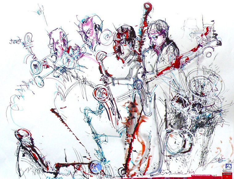
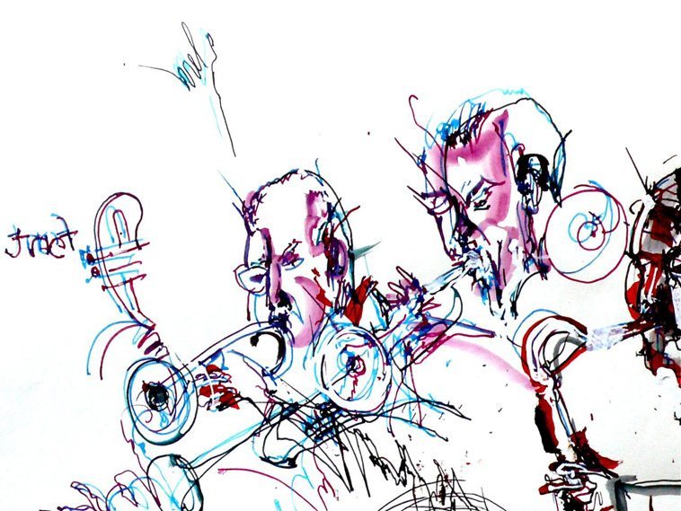
Reid Miles’s
inventive use of type, moody photography and a minimalist colour palette helped Blue Note establish itself as the hippest of all jazz labels. Blue Note Recordings: the name still resonates today. Synonymous with artistic flair, the label is a fading memory of jazz’s ‘golden age’. Yet for all its musical importance, Blue Note was equally significant in terms of design. Under Reid Miles, the label’s sleeves formed a cornerstone of the graphic design canon. Established in 1939 by Berlin-born Alfred Lion, Blue Note was an American label founded on love for an American art form. Intent on capturing the performances, Lion teamed up with Francis Wolff to realise his dream. Wolff was an accomplished photographer, whose moody renditions of jazz’s top cats adorned many early Blue Note sleeves. It wasn’t until the appointment of Chicago-born designer Reid Miles in 1956, however, that the label truly found its graphic voice.
Lion and Wolff refused to compromise creativity, allowing pioneers such as Thelonious Monk free reign to explore jazz’s cutting edge. It’s fitting that Miles’s first notable sleeve was a Thelonious Monk reissue (pictured above). Exploding onto the scene, his bold hyphenation of ‘Thelo-nious’ broke all the rules, treating the syllables as visual building blocks. Blue Note quickly became Miles’s playground; a space to challenge himself, artists and the audience. Interestingly, Miles preferred classical music to jazz, trading in his Blue Note sample copies and not even listening to the music. Given this, it’s amazing that Miles’s designs were so ‘tight’. As Felix Cromey writes in Blue Note: The Album Cover Art: “Miles made the cover sound like it knew what lay in store for the listener: an abstract design hinting at innovations, cool strides for cool notes, the symbolic implications of typefaces and tones.”
Distant style. Dutch designers Experimental Jetset are intrigued by this relationship, saying that it is, “interesting to see that a designer who really managed to capture the essence of his time, was also, in a way, disconnected from that very essence.” Adding that it is perhaps, “distance, not engagement, that makes the designer.” This ‘distance’ is important, and allowed Miles to experiment. He “never settled into a typeface or system”, notes Richard Cook in Blue Note The Biography. Whatever form Miles’s designs took, they bore an unmistakable power. From Sonny Clark’s Cool Struttin, to Freddie Hubbard’s Hub-Tones, Miles, Cook says, “made sure that his sleeves were as heavyweight as the music inside.”
Blue Note is Miles for many, but a number of other designers, including Paul Bacon and John Hermansader, made notable contributions. Pop art god Andy Warhol even made an appearance, yet Miles’s Midas touch was predictably involved, having been behind the decision to commission Warhol to create the cover of Kenny Burrell’s 1969 Blue Lights LP. Talented as Miles clearly was, his position was uncommonly fortunate. With unrestricted access to Wolff’s atmospheric photography, combined with artistic control bordering on autocracy, the elements for great design were in place. Add the skill of the performers, plus burgeoning record sales, and it almost appears as if Miles was home and dry before he’d started.
Miles ahead. While his designs certainly benefited from a sympathetic label boss and Wolff’s superb raw material, Miles added an unquantifiable element to the mix. Like his namesake Miles Davis, his absence was felt as much as his presence. It’s not that Blue Note was visually a one-man-band, but Miles was the prodigal soloist. He galvanised the greatness around him to create legend, transforming the constituent parts into genreredefi ning symphonies of fantastic form and colour. Miles’s greatest achievement was the harmonious blending of modernism with a distinct personality. His greatest sleeves, such as Dexter Gordon’s Go, were unashamedly dynamic typographic treatments. For all his compositional flair, Miles also knew when to play hands-off, letting Wolff’s expressive photography drive sleeves such as John Coltrane’s legendary Blue Train. That’s why Miles’s sleeves fit so well; they visually represent jazz. At once personal and progressive, vernacular and global – reflecting the most human of artforms.
Blue Note was hit hard by the reinvention of jazz in the late 1960s and the label began to drift slowly away from the cutting edge. Dismantling began in 1967 with Lion’s retirement. A sale of the label to Liberty Records followed in 1969 and Wolff died in 1971. The new owners were bereft of invention, lacking the passion and the understanding that had informed the founders’ success. As the viability of jazz came under the spotlight, Blue Note retreated to the safety of ‘straight’ jazz, dispensing with Reid Miles in the process. Stripped of its creative heart, the label was dead in the water. Following a series of takeovers, it was strategically phased out under EMI in 1979.
New directions. Hope arrived with a 1985-label relaunch, signalling a number of reissues and new releases. The label has since regained some of its commercial success, with new artists such as Norah Jones shifting thousands of records. But in an era increasingly defined by artist – and agent – power, much of what the label stood for has inevitably been lost. As current label head Bruce Lundvall conceded to Texas’ Austin Chronicle: “People ask me, ‘is Blue Note what it used to be?’ I say no, it can’t be. All the covers were designed by Reid Miles, and they were great, but the artists didn’t have much say about them. [These days] every artist wants their own cover designer.” Blue Note’s legacy is actually artistic patronage. The label’s success, and the achievements of Reid Miles, were made possible not just through Lion’s leadership, but through public support. It’s easy to look back nostalgically at the era, but there have been plenty of examples since – such as Malcolm Garrett’s 1970s work for the Buzzcocks, Vaughan Oliver’s covers for 4AD during the 1980s and labels such as Ai Recordings and Rune Grammofon, which ably demonstrate not only the importance of good cover design, but also inspire a widespread appreciative fan base. source
The graphic artist Reid Miles made an indelible stamp on the jazz look. His hundreds of album covers for Blue Note expressed an evolved, mature, Bauhausian, jazz perception, the jazz mind. His large simplified block shapes organized in two dimensions utilized as much wide open space as a good jazz solo. Was he a Greenwich Village beatnik? Where did he come from? He made modern and modernism real. Utilitarian. Universal. Comfortable and pleasurable to look at, and into. —Mark Weber
Mark,
Happy New Year !
Beginning with your poetry cover graphic, our initial conversation has opened up to jazz painters and now recording cover art.
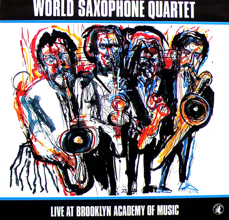
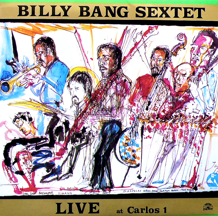
Here are the first two musicWitness® covers from the tail end of the gloriously tactile LP era:
WORLD SAXOPHONE QUARTET: Live at the Brooklyn Academy of Music —Black Saint, 1986.
BILLY BANG SEXTET: Live at Carlos 1 — Soul Note, 1987.
Cover Art was done during the live performances and printed from photographic film transparencies. Cover Designs were done full-size (12+” square) with mat-knife, glue, tape and press-apply lettering.
Soon after their release, both covers were laminated onto the tops of 24” square wooden café tables at the old Knitting Factory on Houston Street in New York City, then moved downtown to Leonard Street until its close. Many more subsequent paintings were done live on those two tables of performances by members of the WSQ (David Murray, Julius Hemphill, Oliver Lake, Hamiet Bluiett) and of Billy Bang’s Sextet (Roy Campbell, William Parker, Thurman Barker).
There have been about 3 dozen CD recording cover projects since those nights, but the hands-on feel, every step of the way, to creative LP sound publication remains a permanent thrill to the body. —Jeff
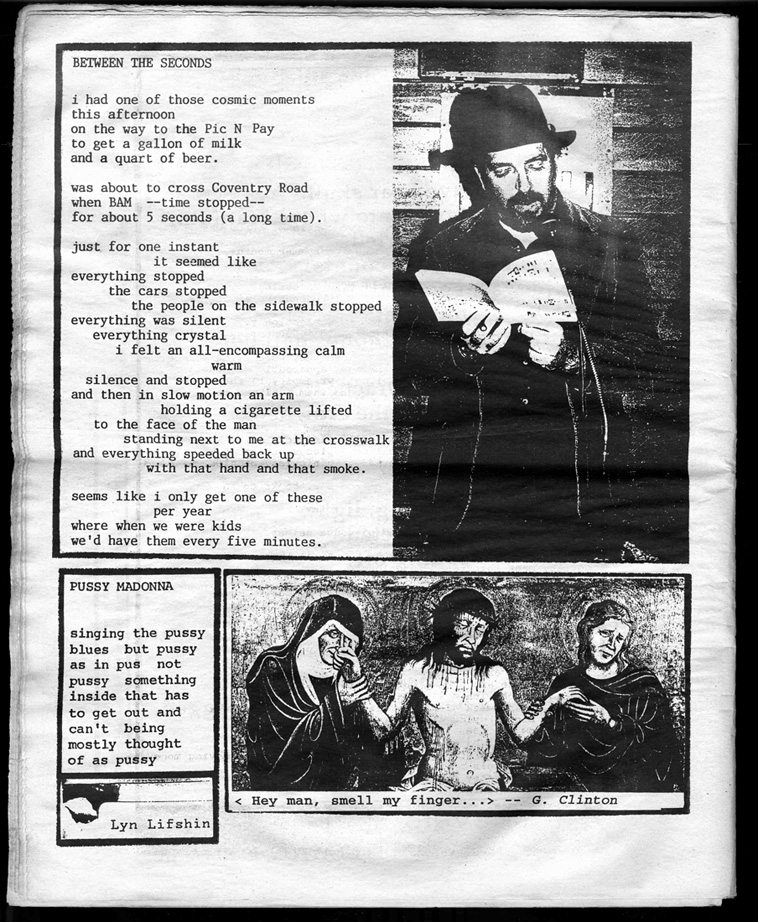
Mark Weber reading in Cleveland @ Barking Spider circa 1988 | Photo by James Lang
Sensibilities are influenced by the times, and they come and go. My fondness for all things beatnik is decidedly a generational thing. Of being born into a strait-laced America of the 1950s, as part of a large post-war baby boom all coming of age at the same time. If Dobie Gillis on tv was intended to be a spoof on beatniks it backfired on me, because I thought Dobie was the stuff. Sitting out late at night to hear the freight train go by was (and still is) vastly interesting to me (Dobie took his dates to listen to trains). Playing bongoes on the beach and drinking jug wine, wearing French berets, sleek girls in leotards, writing spontaneous haikus, and knowing artists who could have raptures over drooling paint was everything I wanted — where do you sign up!
I still harbor romantic notions about bohemian artists in Greenwich Village of the beatnik era. Living in cold water flats in the Village sounded purely romantic to me. And how naturally and perfectly integrated Kerouac went from mountain climbing to hanging out in jazz clubs still amazes me.
Who were these beatniks? Who were these artists that rejected mainstream America? Who lived through the dark days of the Cold War. Who resisted conformity and the mass consumerist delusions.
Who painted those large canvases behind Bird in those photos in Village basement clubs? Who were these seekers who were on the same trajectory as Cezanne, who’s paintings were investigations into how the eye sees, and how the brain sees?
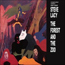 Every city had them — John Altoon, Wallace Berman, Larry Bell in Los Angeles. Bruce Conners, Wally Hedrick, George Hams, Jay DeFeo and Joan Brown in San Francisco. New York City must have been over-flowing with them — John Chamberlain began is compressed auto parts assemblages those years. Bob DeNiro’s dad was a beatnik painter! Bob Thompson who painted Steve Lacy’s album cover THE ZOO, was there. W. Eugene Smith was there. Reid Miles. The circle of painters surrounded Romare Bearden were in & out, and included the late Reggie Gammon who spent his last twenty years in Albuquerque painting jazz scenes (and listening to my radio show every Thursday afternoon! He’d call me up, “Mark, I love you!” and I’d respond, “I love you, too, Reggie.”) David X. Young was painting up a storm and hosting jazz sessions in his loft (see & hear the CD+book collection JAZZ LOFT).
Many of them were influenced by the action painting of the abstract expressionists of the Cedar Tavern crowd. They were purely unrefined and raw and emotional and serious about life. My all time favorite is David Stone Martin, a beatnik to the core. Unfathomable and indefatigable to squares everywhere.
Jeff Schlanger has taken the next logical step. —Mark Weber

Photo by Jim Lang, Cleveland, Ohio
Mark,
Bob Thompson did the cover painting in 1963 for Steve Lacy’s The Forest and The Zoo recording on ESP. We had met earlier, introduced by painter Chris Lane, from the bus to Music & Art.
As Mike Johnston mentioned, the paintings of Thompson, who was deep into the cutting-edge musicians downtown and the beat writers, are saturated in jazz rhythms. But a gifted man got caught in the kind of headlight glare that could force an amiable western poet into exile from his California home. In 1966 Bob Thompson, who brushed out a cultural treasury in just a few years, died at 29 in Rome. Lacy recorded the quartet music that same year in Buenos Aires.
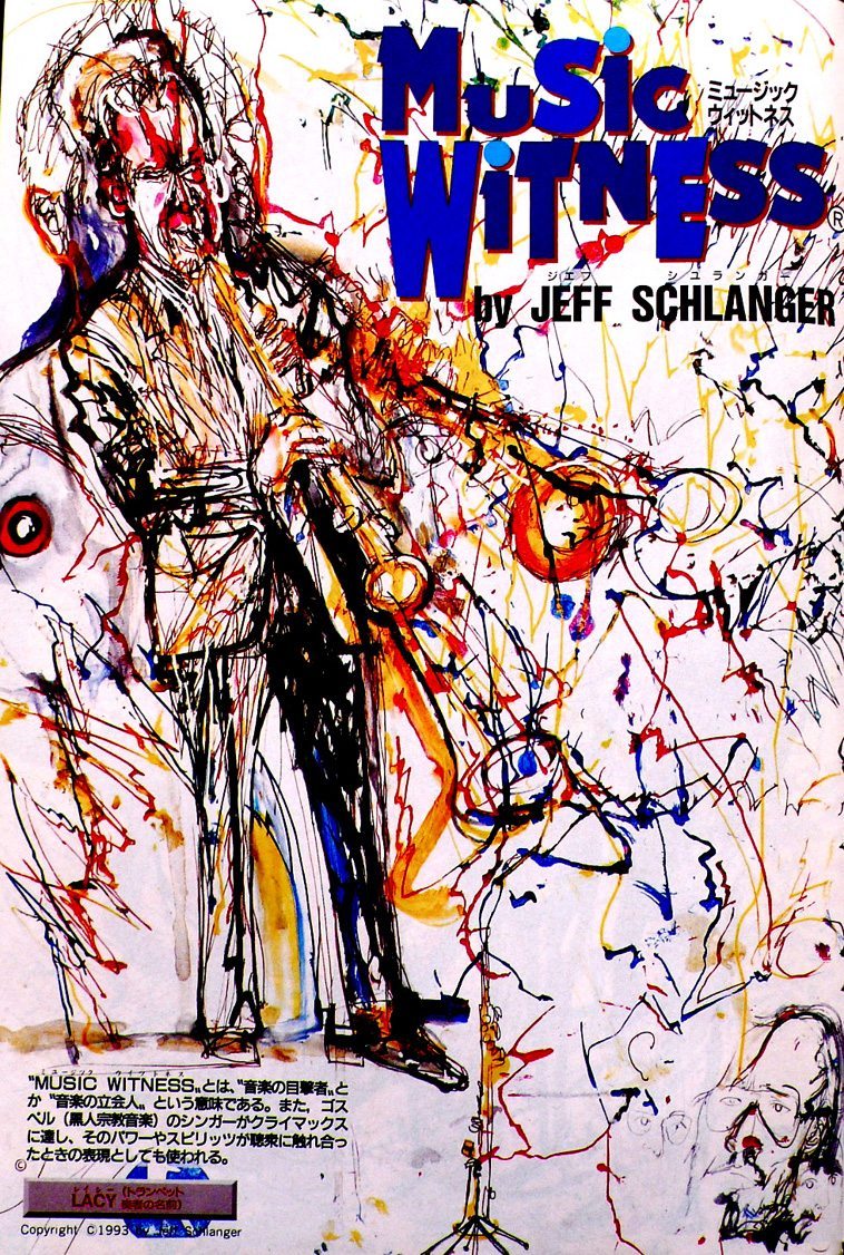
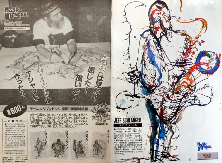
A drawing board was at Steve Lacy’s feet in 1993 when he played a focussed patterns on soprano at the old Knitting Factory. The guy in the lower right corner is the late Irving Stone, who, together with his wife Stephanie, (her ear is in the picture too) were champion listener-supporters of new music live on the New York City scene. They followed John Zorn, Charles Gayle and many, many others from their earliest public performances. (The Stone, Zorn’s musicians club where you and I met last fall, is named in their honor.)
The second set that night was an intense Charles Gayle tenor solo called Preach on my picture. Both pictures were part of a feature
in Morning, a mass-market manga magazine published in Japan as you can see.One World.
Jeff
![]()

This was a totally fascinating article!!!
Hello Mark,
We appreciate your comments about Leo Meiersdorff :) and reading the articles about the other wonderfully talented artists. Yes, the story about Gary Foster is TRUE! Gary tracked down Leo and the rest is history. The family does maintain a website for him http://www.leomeiersdorff.com
Thank you,
Jennifer Meiersdorff
2 STORIES
1) I too walked into Leo Meiersdorff’s gallery in the French Quartet in the late 70s and to this very day have 2 of his prints hanging in our kitchen > one is a 14-inch “Creole Cuisine” and the other is poster-size “Cooking with Jazz” both are masterpieces
2) Just the other day I was thumbing my copy of Bob Thompson exhibition book (Whitney Museum, 1998) and recalled the afternoon Tom Guralnick sent me to pick up Steve Lacy’s Quintet (George Lewis, JJ Avenel, John Betsch, Irene Aebi) at the hotel for the gig that night (early 2000s) and I took this book along because sometimes when you pick up jazz musicians they keep you waiting int the lobby (Kenny Werner kept me waiting till the cows came home) AND so, I was waiting and waiting in the lobby when out of the lounge comes Betsch and finds me, it turns out the entire band had been waiting and waiting FOR me, but I don’t drink, so it doesnt naturally occur to me to go to the damn bar mid-afternoon! hahahahaHA —— Steve looked at me in admiration and marveled that I had this book, he was beaming, the rest of the band had a good laugh over our near-miss connection in different universes
Response to (1): You are probably referring to the Liberty Gallery on Royal Street as Leo never owned his own gallery. He dealt with a couple of others in NOLA and many others outside of New Orleans and internationally, but this one bought quite a LOT from him :) Thank you for your comments about Leo’s art! Best–Jennifer Meiersdorff